Although there is NO substitute for testing your responsive mobile designs on physical devices, performing this kind of testing is often time consuming as it requires us to push code out to web-servers so we can get to it from our devices. Then of course we spot a bunch of issues, fix them, re-release and test again. This process often repeats a few times before we get it right.
It is possible to reduce the number of iterations by doing more “device like testing” in the browser. There are two aspects to control in order to get your browser to simulate a mobile browser more closely. The first is the user agent, and the second is the screen size.
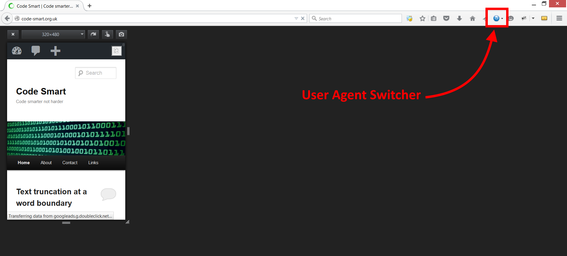
There are many tools out there to help us alter the user agent. As I mentioned in my blog post entitled Essential FireFox add-ons for web-developers I tend to use the FireFox User Agent Switcher.
That just leaves the screen size. FireFox has a great tool called the Responsive Design View which allows you to set a custom screen size after pressing CTRL+SHIFT+M.
Once you’ve faked the user agent and reduced your screen size, you should be able to find more issues with your responsive designs in your own browser without the hassle of continually pushing code out to your web-server.
Here is a screen shot of FireFox pretending to be an iPhone 3: